Tip
Pairing colours in decor (the simple method)
Daring to use colour is scary, because we fear a misstep. Yet a few simple rules make almost any pairing work. Here's enough to get started without going wrong.
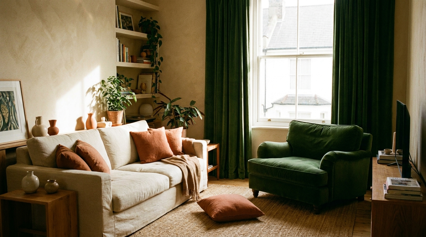
The 60-30-10 rule
The basics: 60% of a dominant colour (walls, large furniture, often a neutral), 30% secondary (sofa, curtains, rug), 10% of a bright accent (cushions, decor, art). This balance avoids both blandness and overload.
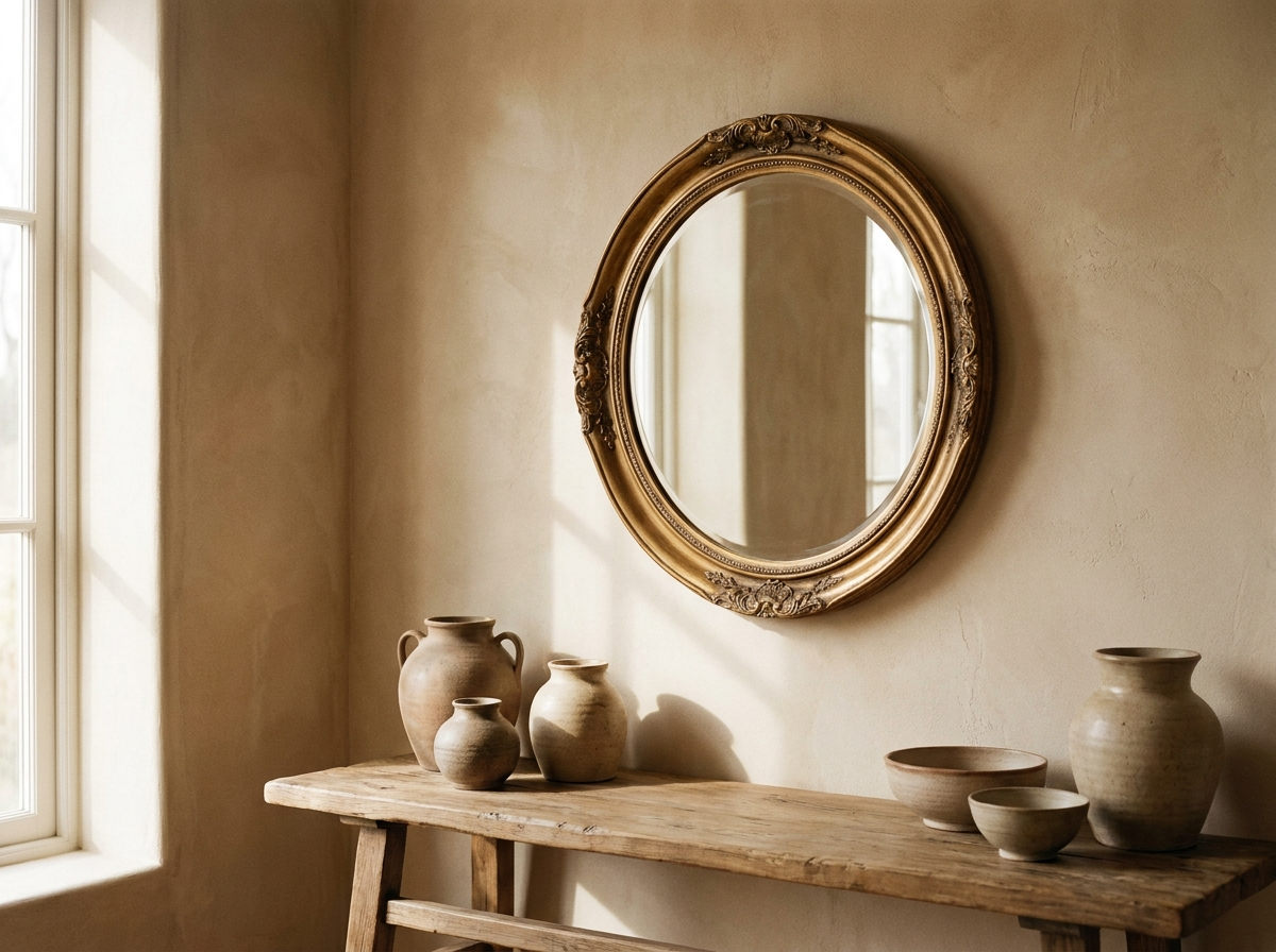
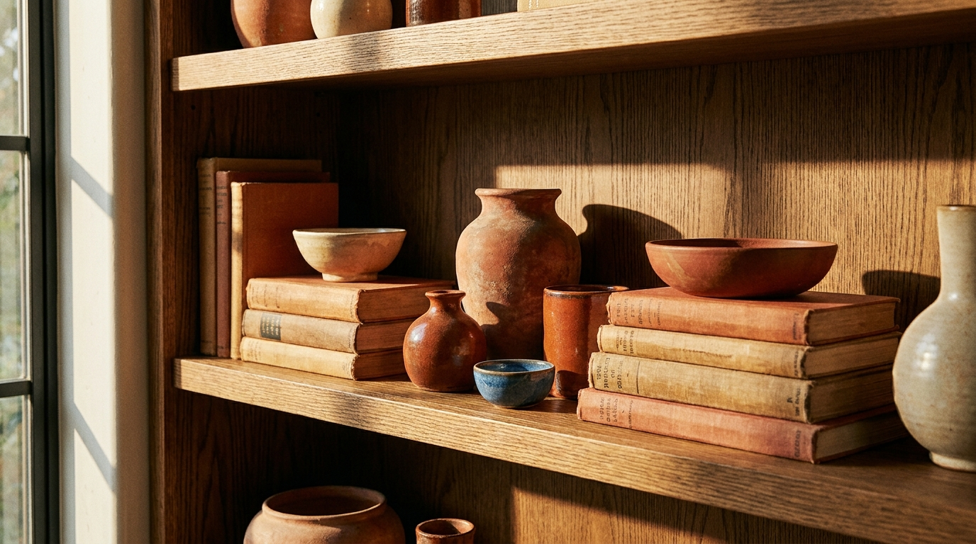
Pick from the same family
Tonal schemes (different shades of one colour) are foolproof and calming. For more zing, use neighbouring tones on the colour wheel (terracotta + ochre + rust): still harmonious because they share a warm base.
Neutrals aren't 'no colour'
Beige, linen, taupe, warm grey: these let the room breathe and make the accent pop. Good decor is often lots of neutrals and one or two strong colours, not the reverse.
Wood and greenery count
Wood (warm) and plants (green) are colours in their own right that pair with almost anything. Count them in your balance: a 'neutral' interior full of wood and green is already colourful.
Test before committing
Buy samples, put them on the wall, look at them morning and evening: light changes everything. A green that looks soft by day can turn khaki at night. Three days of observation beats one regret.
Remember 60-30-10 and start small: swap your cushions and a throw before repainting. You'll quickly see what works in your space.

Want to try it at home?
With Spaace.it, snap a photo of your room and get an AI redesign in seconds. Plus find all our decor tips on the app.